A little birdie will not have any part in the following proclamation. I am out and proud about the fact that… it's my birthday! It's not what you would call an important one. Last year I had a big party for my 30th, so 31 in terms of milestones is nothing on the surface. However, I feel it is somewhat significant for me, because unlike last year with all the glitz and glamour of my fancy roped-off Brisbane nightclub soiree with ballerina cake (a nod to my childhood ballet days), I am accepting of what is occuring. There is no panic and mortality-related anxiety attacks, no contemplation of botox just because it seems like the thing to do when you turn 30… Not even any Googling Thailand boob job tourism…
This year, for reals, I am entering my 30's good and proper, and I'm cool as a cucumber. This is because, my friends, I am what I call a Grown Up. I have evolved. *SMUG*
Having said that, for my birthday celebration I am heading to a Gold Class showing of The Hunger Games Catching Fire, which may be a YA fiction adaptation…. but did I mention Gold Class? I mean, that is for real grown ups, right? And I might go to Grill'd after – that's the grown-up McDonald's, isn't it?
I promise I will upload an Instagram shot of me being very grown up at the fancy cinema… watching my kids' movie… ahem. Hey, it's my birthday, and I'll fake adulthood poorly if I want to!
Just in case you missed it…
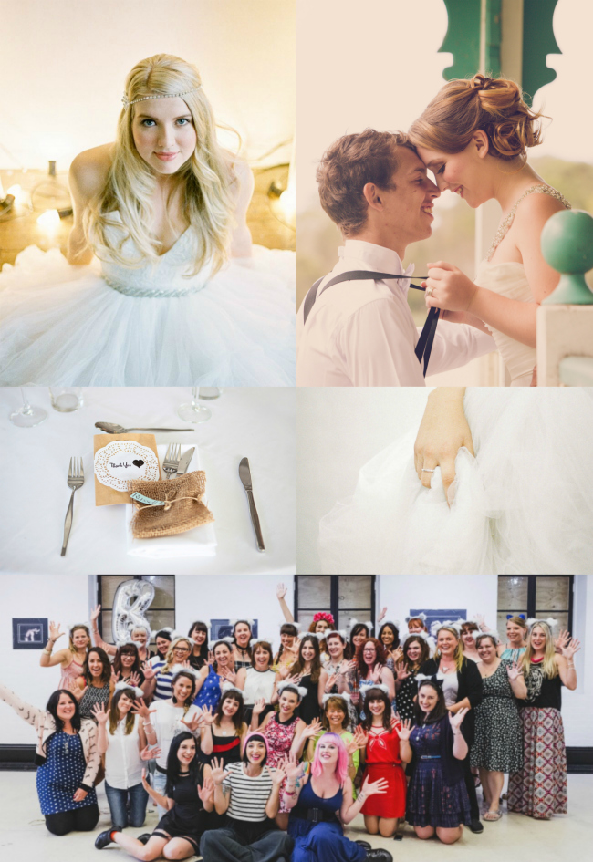
A chapel wedding with gorgeous DIY details
I recapped my experience at The Blogcademy in Brisbane and made a confession
We shared a Chinese explanation of the ring finger tradition with a practical demonstration that blew us away
There cannot be a styled shoot prettier than this one we published in our latest magazine
Although this one is up there, too! Pretty vintage styling at Twin Waters
////
Local Wisdom
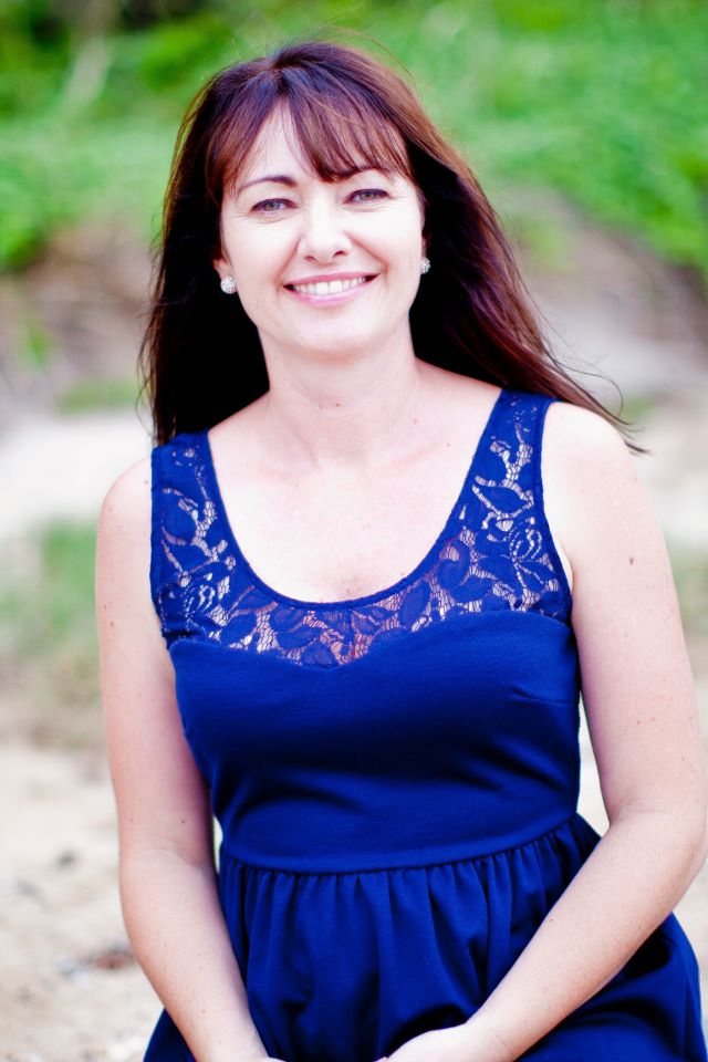
Cassandra – Coastline Celebrant
Best coffee shop: Love meeting with clients at Daisy’s Place
Best spot for being inspired: Double Island
Fave restaurant: The Long Apron Restaurant
Best place for guaranteed fun: Beach with our two children
Where you always take visitors: Mooloolaba
What you always tell your couples: Have fun!
New to The Bride's Tree
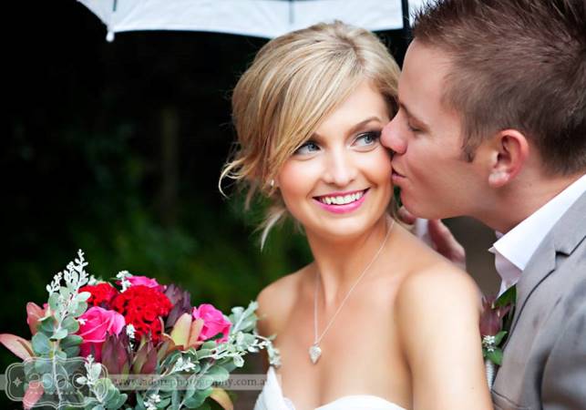
Adore Photography
Beautiful and natural wedding photography. Have fun and feel at ease on your most memorable day with the lovely Karlie as your memory maker.
Sunshine Coast Videography
Professional and unobtrusive, SCV offers wedding coverage options to suit varying budgets. Their films are thoughtful and capture the true essence of the couple and their special day.
Life on the Big Screen – Celeste & Cam's Short Film from sunshinecoastvideo on Vimeo.
Main image from Death to the Stock Photo
Today, my most fave wedding pros, I would like to discuss something quite dear to my heart. Advertising, and how to make proper use of your advertising space in relation to banner ads. We have banner ads here at The Bride's Tree – your right-hand peripherals are enjoying them right now, in fact. Some of you reading this may even have a banner advertisement with us, and after reading my tips, if you would like to personally discuss your ad and any specific tips I might have for you, please do drop me a line or give me a buzz!
Here are my top tips for creating a banner ad that is not only attractive, but that will work for you. They are very much take-what-you-will-type tips. So, as the name suggests – take what you will.
1. Be clear about what you actually do
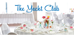
If your business name does not clearly outline what you do, in manner of Alan Hughes Photography, for example, make sure it is explained visually. A good example of this is The Yacht Club banner ad. While they do not have "wedding venue" in their title, it's explained visually with an image that is clearly showing their function room set up for a wedding.
2. Appeal to the site's visitors
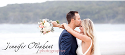
Remember the site you are on has an audience already. And that audience is coming to the site for the reason it's intended. For example, The Bride's Tree exists solely for inspiring brides planning their wedding on The Sunshine Coast. The site sports muted and tasteful branding, and while the last thing you want to do is blend in, you don't want to stand out like a sore thumb either. Someone who has clearly taken into account the style of the site, the client they want to attract and what the site visitors expect, is Jennifer Oliphant Photographer. She has cleverly used an iconic visual on one of our stunning beaches the region is famous for.
3. Don't be afraid to use colour to stand out from the crowd
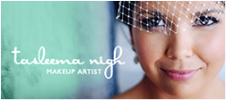
I know, I know, I just said consider the existing colours on the site, however within reason it's completely fine to use a bit of colour and an eye-catching image. A fabulous example is this one from Tasleema Nigh Makeup Artist, which always catches my eye in our side banner.
Also, play with your font/logo colours. Just because your logo was created in black, it doesn't mean it can't be changed to white to stand our on your photo background. Or use a bright colour that will pick up accents from the photo – again, see The Yacht Club's banner ad above.
4. Be legible!
It's also not wise to insist on branding consistency if your logo is unreadable in this particular forum. Don't be afraid to stray from your branding in a banner ad, it's only a small space, so instead use an alternative option that is legible, or even consider using a photo only and making the image so enticing they will want to click on it just to find out who you are and what you do.
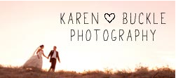
Karen Buckle is an extremely well-known Sunshine Coast photographer. I love her branding, because it is simple and pretty, and allows her work to do the talking for her. Also, she is free to use alternative branding elements where it will work best and suit the medium or feel. This photo has a natural, rustic feel to it, so using a "less polished" font on this image really works, and she has added in the word "photography" to her logo to ensure her message is received. What is her message? "I'm an awesome photographer. You want to know more about me." – it's as simple as that.
A side banner ad is not the place to list everything you do in your business. Remember, if you can't read it, nobody else can. Don't be blinded by your own familiarity with your branding. Imagine this is the first time anyone has seen or heard about your business – and in many instances, this will be the case – you want to show, not tell. Show your potential clients that you are an "Experienced Pattiserie Chef" by putting a picture of a cake in your ad, forget the spelled-out credentials.
Entice with the visual, and they can read all about it once you have lured them to your site, you cheeky thing. While you are at it, don't bother listing your web address, it is quite well understood that clicking on your ad will take the clicker directly to your site. Taking away the clutter will leave your ad looking much more appealing.
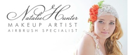
If you do want to add in a little note about what you do to help your ad stand out from others, just be sure the rest of your ad is left uncluttered and it is all still very much readable. Natalie Hunter Makeup Artist has done this very well by including a note that she is an airbrush specialist. It is in keeping with the rest of the ad, and with plenty of white space, it does not appear overrun with information.
5. Sell a feeling
Say for example you are a photographer. You may be tempted to display your best most impressive image of a landscape with a view – an epic sunset or your most artistic shot that your photographer pals have complimented you on so many times you've lost count. Let me tell you, my friend, this would be a mistake. Oh yes, because you are not selling your photography packages to other photographers. You are not selling to an art studio, you are not hoisting your photo up on a cafe wall to sell on consignment, where indistinguishable faces might actually be an asset.
Who are you selling to? A bride.
What does a bride want? A feeling.
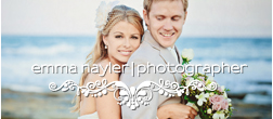
A hybrid feeling of romance and happiness. She wants a moment, where her world is so perfectly bursting with love and contentment. She wants a moment like this one Emma Nayler Photographer has used in her banner ad.
Who wouldn't buy this moment if they could?
This works for businesses aside from photographers. If you make cakes, use a photo with an ecstatic bride and groom feeding it to one another (of course with your brilliant creation front and centre!), if you're a florist, what about a bride picking up her bouquet and taking in the scent? If you're a dressmaker, a first-look photo would be AMAZING – that look on the groom's face in reaction to your design? Priceless!
More banner ad resources…
Kat Williams wrote about this very subject in her Green Room on Rock n' Roll Bride and has some fabulous tips for advertising over achievers.
Remember this one thing…
If in doubt, bring your mind back around to the purpose of your banner ad in the first place, which is this and only this:
Your banner ad exists to drive traffic to your website
That's it. Wholely and solely. It is not there to convey every message you have about your business. Your profile, your editorial, your social media and your own website are the places you should look to for conveying your key business messages. Your banner ad is there simply to make a good first impression and entice people to click it.
To my completely adored Bride's Tree vendors, please do contact me for your personal consultation on your banner ad. If there's one thing I love doing, it's giving my opinion!

